UI/UX Design | Web Design | Responsive
Solo Project | Duration: 2 months (June 2025 - August 2025)
Visual communication and signage company based in Brazil, known as a regional benchmark for excellence and innovation. The company offers a wide range of services, from signage and branding to large-format printing and custom displays.
The company approached me to deliver a complete redesign, focused on usability, clean interface and visual identity. In this case, I led a full UX/UI redesign of their website, identifying usability issues, improving structure and creating a more professional and user-focused experience aligned with their brand.
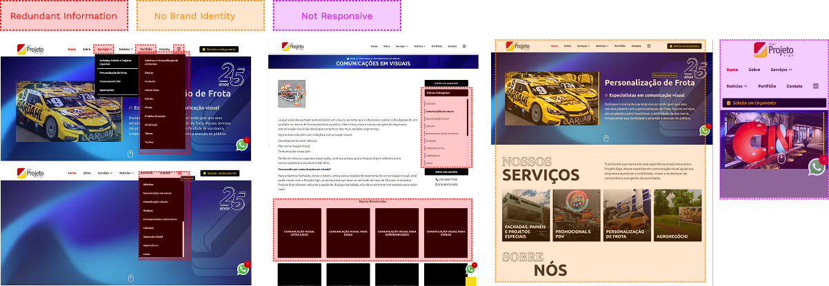
The original website presented several usability issues, such as outdated visuals, poor navigation, and unclear service information, which made it difficult for users to understand the company’s offerings or get in touch. Also, the website structure was redundant, for example, the homepage navigation bar included "Services," "Portfolio," and a menu icon, all leading to the same content. Overall, the site failed to reflect the professionalism of the brand.
I conducted a survey using Google Forms to better understand which CTA the website needed, what visitors are looking for when accessing the website, and how to make it easier for the target audience to achieve their goals.
Prefer to contact companies via WhatsApp.
Consider the following most important:
- Clear information about services
- A portfolio with real examples
- Easy contact options
Value an organized and modern layout, as well as credibility (certifications, reviews)
To identify usability issues in the original website, I applied heuristic evaluation principles. Using Jakob Nielsen’s principles as a reference, I was able to assess efficiency, consistency, and error prevention, ensuring that the final solution would provide a smooth and intuitive experience.
To solve these issues, I focused on creating a simple but effective and responsive layout. The navigation was simplified with clear CTAs, reducing redundancy and helping users quickly find what they need.
The redesign aims not only to improve usability and reflect the brand’s professionalism but also to increase engagement, build trust, and ultimately convert leads into customers.
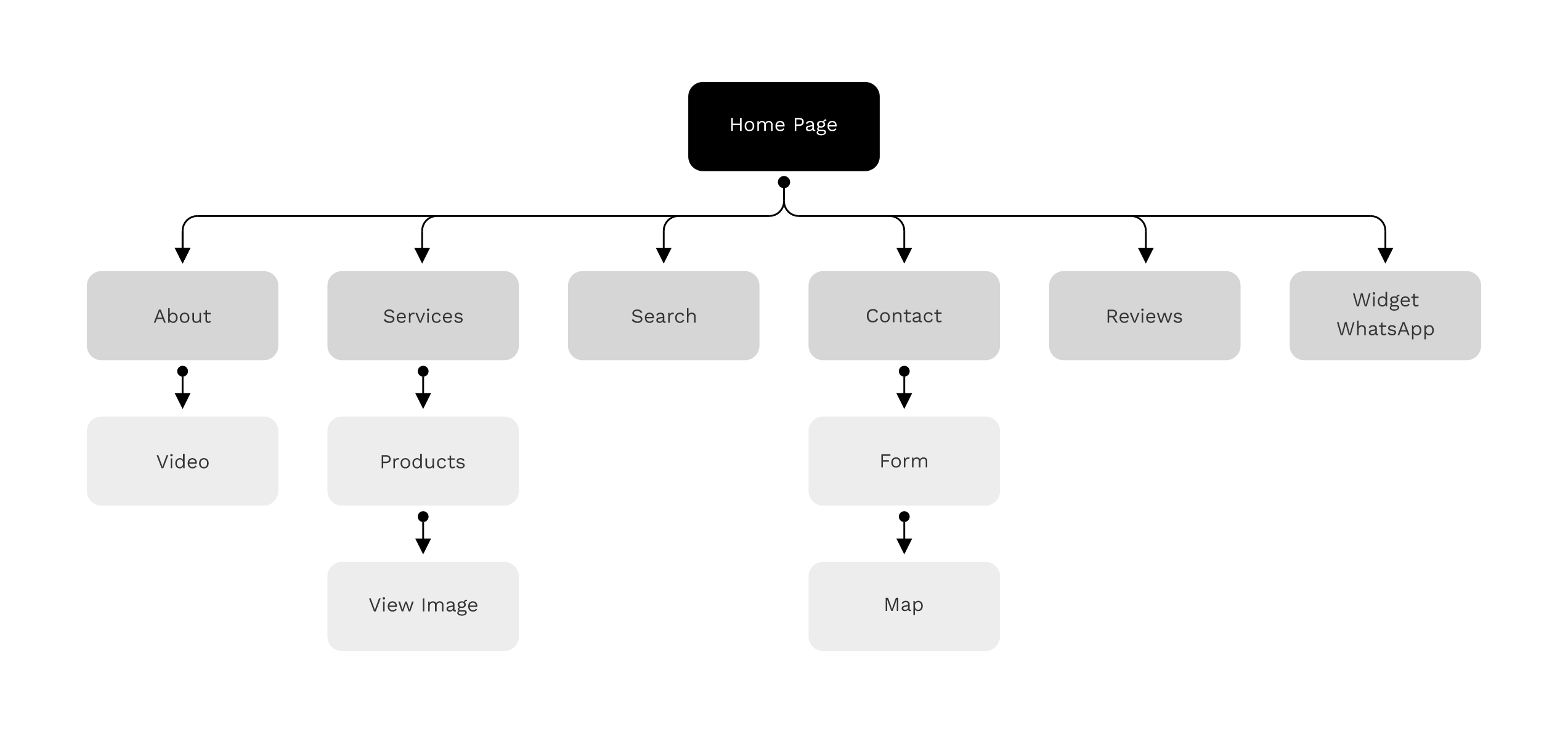
At this stage, I focused on structuring the content and user flow, prioritizing clarity and ease of navigation. The mid-fidelity wireframe allowed me to validate the layout hierarchy, highlight key CTAs, and simplify redundant paths before moving into high-fidelity design. I used a 5-column grid onto the mobile and web screens.
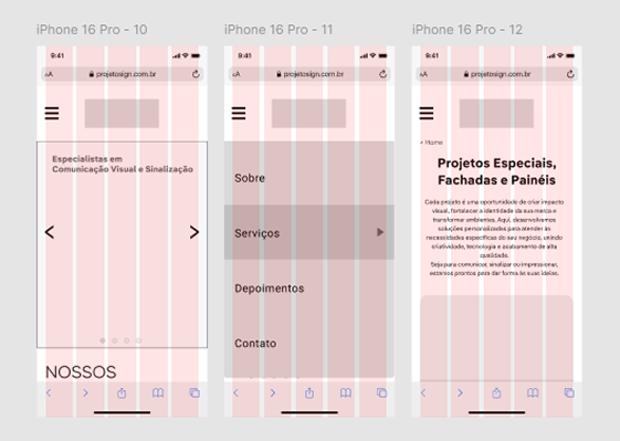
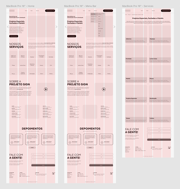
Website mid-fidelity wireframe
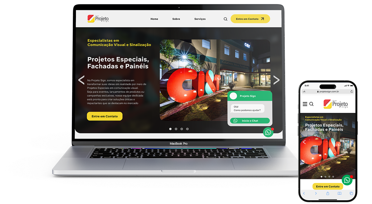
I focused on defining the visual hierarchy and structure of the website. The goal was to ensure clarity, coherence, and alignment with the brand’s identity, while keeping usability and accessibility at the centre of the design. To illustrate the transformation, I placed the old website layout side by side with the redesigned version.
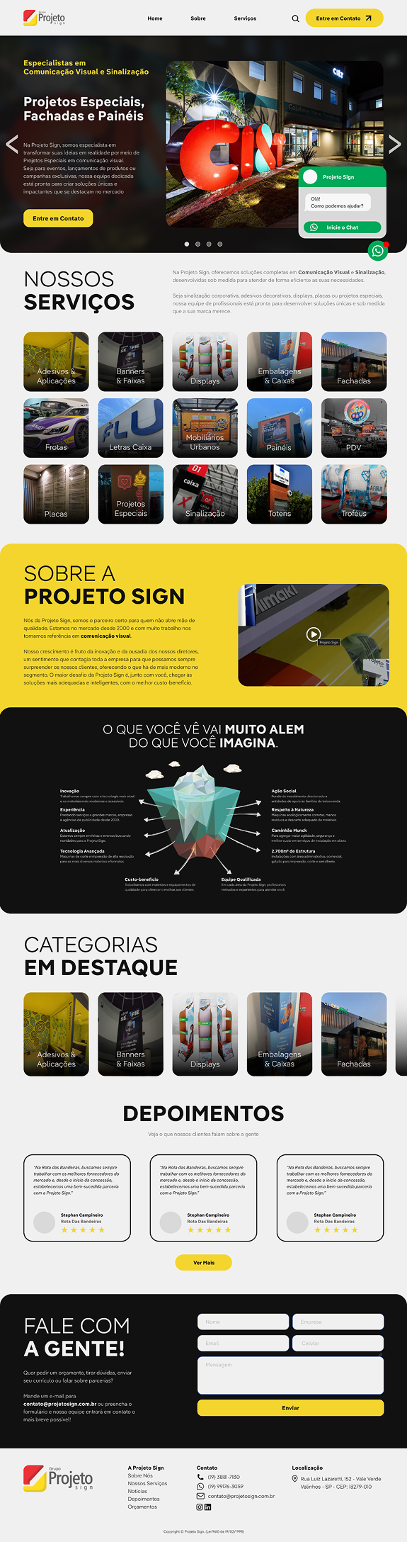
Home - Previous Version
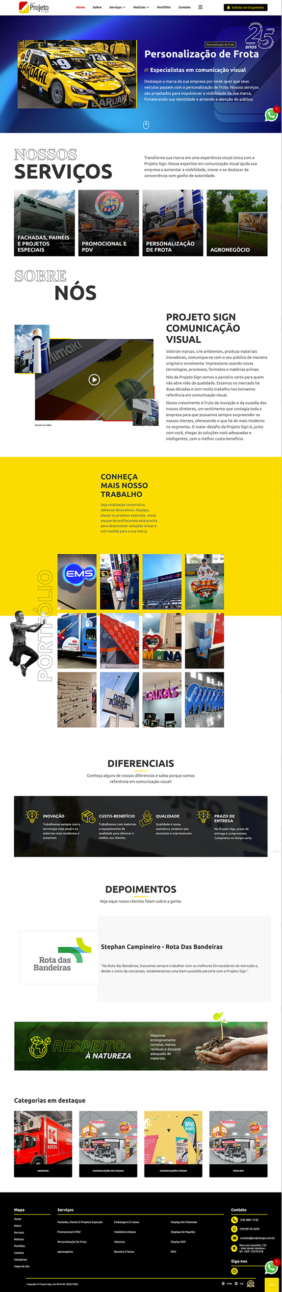
Home - New Version
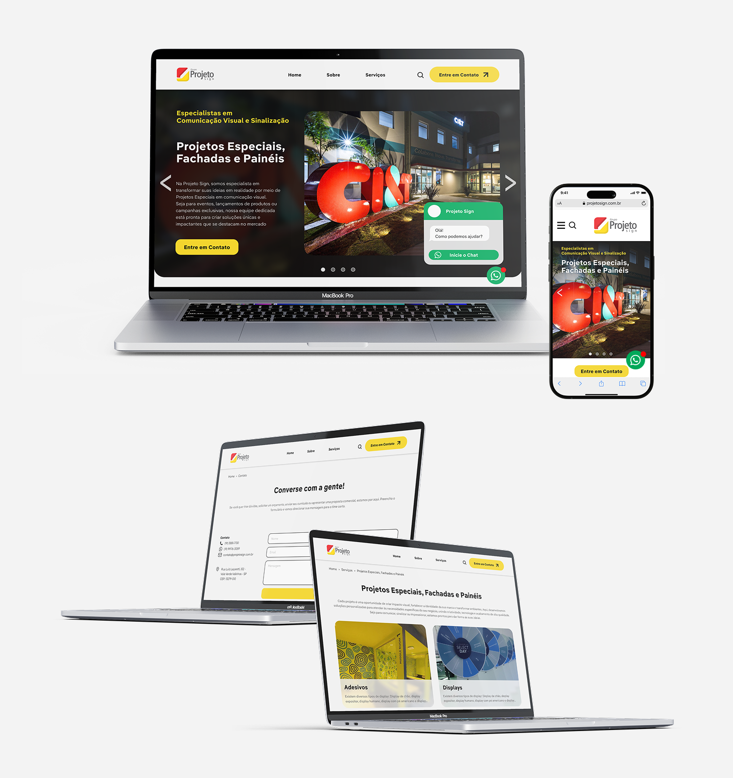
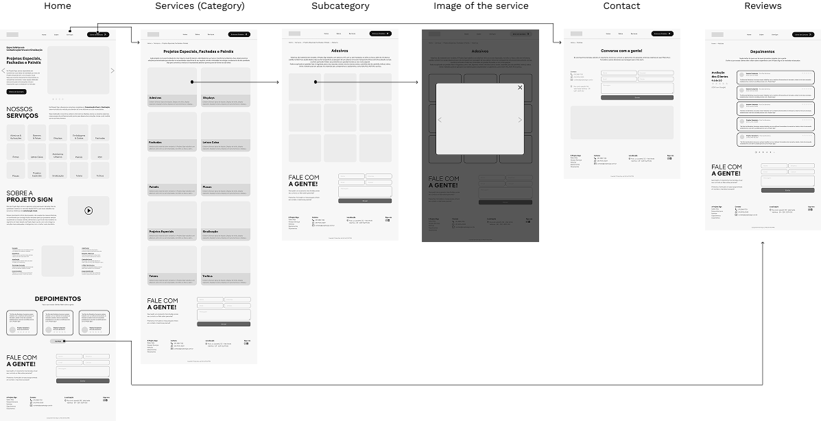
The high-fidelity prototype highlights the main navigation paths and essential interactions, showing how users would move through the website. It was designed to simulate the final experience, focusing on clarity, usability, and a smooth visual flow.
Redesigning this website was such a rewarding and enjoyable experience that helped me deepen my understanding of UX design and refine my UI skills. Learning from users’ perspectives made it easier to focus on what was important and which elements were less relevant. I realised that good design isn’t just about visuals. It must be built with meaning and purpose. The final result brought greater clarity, consistency, and a smoother user flow.